Searching for the essence
from simplicity
from simplicity
Dolça llibreta is a project based on three main areas: bookbinding, training and decoration of spaces. Three disciplines where continuous learning is put into practice: research and the constant search for new techniques.
Identity and
corporate image
corporate image
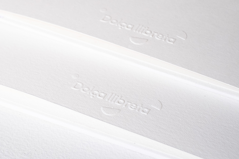
We have developed the design of its identity and corporate image, which accompanies it in its continuous learning process. A brand that conveys its essence, bringing color and dynamism to the subtlety and delicacy that characterizes the Dolça llibreta.

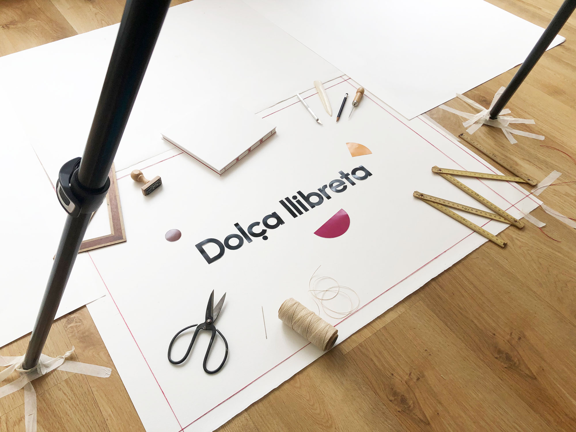
Cactus has made a stop motion re-constructing the logo. This kind of projects motivate us because they allow us to work with creativity, taking the brands further.
This stop motion acts as the cover and presentation of their new website also developed by Cactus.
This stop motion acts as the cover and presentation of their new website also developed by Cactus.
Color scheme
#803915
#df8100
#9f0854
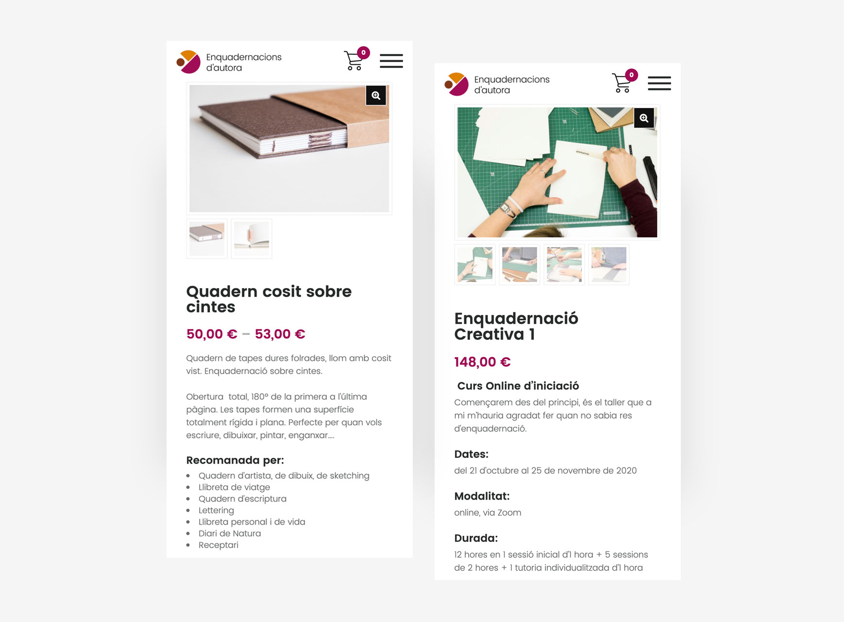
After evolving towards a more commercial trend and entering the field of training, Dolça llibreta has seen the need to renew its website and turn it into an online store where you can buy bindings or book places for the trainings carried out by Marta.

Entrepreneurship
and sorority
and sorority
We have known Marta since the moment we developed her corporate identity, and thanks to the connection to the network of entrepreneurs in Sabadell, we met again to work together again to create her online store.

